Intro.
After deciding on pursuing starting point 22 c I will now research photographers relevant to the starting point and use research of photographers from a range of sources. I have decided to starting point 22.c because it seems more interesting then my generation. I think this because I live in my generation and see it everyday. it would be quite interesting to document it but I don't think it will be as interesting as street signs/furniture as this seems more like it will take me to more places and see places i haven't been seen before. That is the main reason i will be picking this starting point.
After deciding on pursuing starting point 22 c I will now research photographers relevant to the starting point and use research of photographers from a range of sources. I have decided to starting point 22.c because it seems more interesting then my generation. I think this because I live in my generation and see it everyday. it would be quite interesting to document it but I don't think it will be as interesting as street signs/furniture as this seems more like it will take me to more places and see places i haven't been seen before. That is the main reason i will be picking this starting point.
oil painting
oil painting is an art form which is basically moving wet oil based paint onto a canvasser in such way it expresses an emotion or paints a picture. there are many different type of oil paint which all have there own aspects and things can be defused into the oil such as frankincense to create more effect. Frankincense adds a gloss to the image. Early examples can be traced back to the 4th and 5th century where India and Chinese painters in western Afghanistan painted things for Buddhism. it became popular to use in the height of the Renaissance when its benefits where discovered by the western nations. there are many different techniques, many of which use different oils for different thickness and drying speed to create different brush patterns and effects. most oil painters paint in layers to create a fuller effect and more of a three d effect. famous piece include the Mona Lisa painted by Leonardo Da Vinci, the milk maid by Johannes Vermeer.

Martin Kippenberger
Martin Kippenberg was a German artist born on the 25th of February who was widely regarded as one of the most talented German artist of his time. by Roberta smith who worked for new York times. During his life his work never sold for more then $10,000 but a painting of his sold for $5.1 million in 2012. unfortunately he died in 1993 so saw none of his appreciation like many artists. He died at the age of 44 of liver cancer. He managed to survive in his life as his mum passed away and left him enough money to live on. He didn't spend all his time in German in 1984 he brought 35% of a Italian restaurant.

This is a painting done by Martin Keippenberger. The picture is of a street in an suburban area. it looks like it is of a Spanish street. In the foreground the pavement begging and then is met by a group of table and chairs. Next to the table and chairs is a is a bar and above the bar is a sign directing people into the bar. The bar has two windows and a door. The row of buildings the bar is in then slowly stairs away into the distance. The pavement follows but instead of zigzagging to fit the buildings it just goes almost straight up. Parked on the road next to the pavement is a car. Then on the other side of the road and going into the distance is another row of buildings. Then in the middle of the of picture is a lamppost which has been distorted and made curvy. The whole painting bar the signs is painted in shades of blue. The effect this has is it takes the mood down. Due to this you can tell it is a very serious painting. The brush strokes used also make it seem like a serious piece of art. Due to it being serious it is seen as a good piece. The way is painted makes it seem serious and professional but it has been painted on to a wall. This is a less serious way of painting. you can tell it is painted on a wall because the lights stick out from the wall which has been lit up. The other thing bringing it down from being serious is the red and the lamp. the lamp is curvy making the painting more diverse as with out it would be filled with straight lines and blue. The red might symbolism lust in a very straight world as the blue and straight lines make it serious. overall it is a very balanced painting. the fact is balanced is due to the points I have just made. The effect this has is that is brings the painting down to earth for everyone to enjoy not just the critics.
Black and White photography
Taking photos has been around since photography began, this was because they had no other choice. Nowadays black and white photography is a type of monochrome photography, this means that it only takes into account one shade or colour, in this case it is grey. the earliest form of black and white wasn't in fact black and white it was more of a yellow and black called, sepia. lots of the time nowadays black and white is used to symbolize age, they may be a black and white clip in a movie which has been created to seem old, the same is used for sepia but that normally is used for even older flashbacks or so forth, An example of this Schindler's list which was made in 1993, it was about ww2 and was shot completely in black and white apart from one scene. This came out after about 40 years of having colour films. in photography it is used for many effects, one of the most notable is to create higher contrast levels in photos.

Robert Frank
Robert was born in November 1924 in Switzerland. He was a Jewish Swiss Photographer, film director and author and his most notable work being 'The Americans'. His mother was Swiss but his father was left stateless after the land changes in world war one. This meant his father had to apply for citizenship for him, frank and his older brother. They stayed in Switzerland throughout world war two. And were constantly under threat of his country becoming Nazi controlled. Due to this he new the real meaning of oppression and turned to photography to escape his real life troubles. After the war frank moved to America where he got a job as a fashion photographer at happers bazaer. He then went on to take over 28,000 of America and put a book together called 'the Americas' After this he moved into film and video before moving back to still life. he is still alive and is 89.
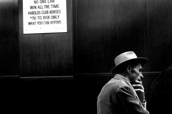
This is a photo of a man in a room with a sign behind him. The sign reads 'no one can win all the time Harrods club advises you to risk only what you can afford'. This is all is block capitals to show the important of the sign. But there is a bit of the sign rub off which also shows the oldness of the sign. The photo is also in black and white. As the photographer mainly took photos before colour. Especially his early stuff. there is also a man in the photo. the man is in front of the wall with the sign and in the foreground. The man has a hat on. this creates some nice shadows as the light source is from the top. this placement of the light source also creates emphasis on the sign. This makes it the main aspects of the photo as its very light. This creates a nice contrast as most of the photo is dark. The only other light part of the photo is the main which makes the rest of the photo full negative space. This allows the viewer to concentrate fully on the subjects By doing this the photographer has controlled what the viewer sees. An interesting part of the photos is the textures. as there is no colour the textures give clues on what there is in the photo. For instance you can tell behind the man is wood due to the grains. The wood in the middle of the photo helps break up the photo due to the grains all pointing downwards and the planks are pointed sideways. the contrast textures of the man in the coat and the signs are important as well. the sign seems very hard and clean but the mans coat is soft and inviting. Although the man doesn't seem to be very inviting he is very bony. His stance seems like he is trying to hard something and his outfit fits a outfit of the time period as a gang member. The fits the picture as many gambling places where owned by the mafia.

This picture is of a sea side view with a sign across the hung across the middle of the picture the sign reads ' for the glory of the wind and the water'. The picture was taken on a trip to a art academy. in the foreground is the sign the string and a pole. in the background is the beach and sea and sky. the photo is in black and white like most of his work. The sign is written on a window which through it you can see the sky. on the beach there is some poles. The contrast between the sea sky and dark beach is quite low. its a very grey photo. The only darkness and light parts are the frame around the window and the waves. This is nice though as they sort of clash to give a bigger difference then if they were by themselves. as its is quite a lot if grey it makes it easy to look at. The sky works well too because it sort of clashes with the sign to bring it out making it the main aspect of the photo. there is a nice frame to the image. with the negative space of the sky then also with the pole. this sort of tells u where to stop looking making it easier to see the main thing the photographer wants u to look at.
collage
Collage - stems from the word 'coller' which is french for to glue. It basically means in the art form to put together a collection of images in one image. It has slightly different meanings but all basically mean lots of things together. This is a technique which has been used for a long time with making images larger then they would be normally only. this allows the photo to be more detailed as you have all the picture of a wide angle lens but then all the detailed of a normal picture which has been taken up close. This technique is mainly used in visual arts but can and is used in music as well. but this is normally called a mix. It is made of of lots of items and can be made up from newspaper, magazines or photos. the earliest signs of this techniques . collages made from photographers are called photo-montages, they can be created by cutting and gluing photos together. this has been made easier with the modern era with advances in photo shop and other photo editing software.

David Hockney
David Hockney is and English artist who lives in Yorkshire and London. he grew up after the aftermath of world war 1 and had a father who was against it. David is a seen as an important contributor to the pop art movement in the 60's as well being seen as one of the influential artist for Britain in 20th century. He liked to do works on portraits of his friends as well as do art for stage performances. one of his best know works are called the 'joiners'. his early photo montages were of his mum but he later progressed into doing the one I'm evaluating below. He has had many exhibition of his work his first being in 1963.

This a photo montage done by David. This being one his most famous photography pieces. the piece is called pearblossom highway. It was taken between 11th and 18th of April 1986. it was not just taken at one place. as he traveled being the passenger and driver he noticed different things which would interest one of them and not the other. For example you can see on the right of the road there is road signs and road markings, as well as a better road lay out. on the passenger side of the road there is nothing except for open fields rubbish and trees. This is the things the passenger would notice. the road is less detail and correct which may have been what it would feel like for the passenger. The colours used in this photo are quite important. The sky is deep blue and look even water like. The the contrast bright desert and sign compliment making it look even bluer. The you also have the green and brown which blend into the desert. He has also done the stop sign very well it is slightly darker then a normal stop sign. This means he is minimize the colours used and not over crowding the photo with information. you may argue as lot of the different photos make it over crowded he has done it in a simplistic way managing to keep it simple yet with the complexity of a collage. colleges are a nice way of done large areas in a bit of a different way. With colleges it always creates a nice frame even though that might not be the idea. with each photo being slightly different then they all stand out.This means that when there is an edge which they all stop and star being the same eg the page, then it makes a nice difference to looking at a messing mess. As all of these photos where all taken on a different day then they are all a bit difference.

This is another photo by David hockey. This is part of the joiners group. It is similar to the last but instead of a desert back ground its a street in a European country. In the photo is a round about then cars going of down the street which is opposite to the photography. Like in the last using multiple photos to get this one piece has made the photo better by adding more interesting things to look at. This photo like the last was taken over a couple of days. You can see this due to the lighting being different on the buildings and street. another interesting feature about this piece Is the fact its slightly all green. As this photo was taken from numerous places this cant be due to the lighting from object like the trees. this means this piece3 was probably edited after it was taken to allow it to flow nicer. These photos where probably taken in the summer time. you can tell this because the trees are green. this means that the must have been a high aperture. this is backup by you can see the building in the background clearly which would be faded if a lower aperture was used. the trees being green helps add depth to the photo as if it was just a photo with green tint it would be a bit bland. but as there are an object which allows it to add depth and give something the viewer can see is creating the green light.
Film photography
Film photography, as you can tell from the name, is done completely on film. Most of the time there are no, or very little, computers involved. The first official photo was taken in 1827 by Joseph Nicephor Niepce. this photo was printed on to a camera obscrua which then faded away after several hours. After this there has been many types of film; e.g. nitrate film, safety film. When photography first became open to a wide audience in the early 20th century it was made by a company called Kodak. This was the preferred choice for most people because it was tougher and safer the the alternatives at the time. Although technology has out grown film many photographers still shoot in film for many reasons. One of the ones being they can be much higher quality and can print to much larger size before distorting. Another big reasons is old habits die hard. Many professional photographers have been around since before DSLR which where introduced in the late 1990's.

Joel Meyerowitz
Joel was born in march 6th 1938. He first got into colour photography in 1962 and was inspired by the likes of Robert frank. he is best known for his book 'Aftermath: world trade center archive'. He was the only photographer allowed unrestricted access to 'ground zero'. including his photos in aftermath he is the author of 16 books. In 1970 he was the first photography teaching colour as it wasn't considered an art form. he also stared heavily in bbc documentary 'the genius of photography'. he is 76 at the moment and living in new York.
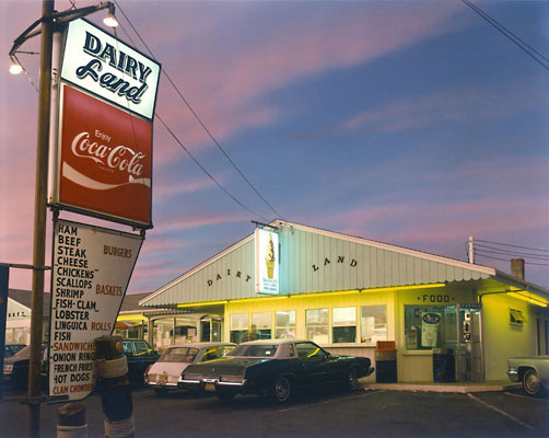
this of a photo of a hotel. It isn't the best of hotels. the hotel motel is called dairy land. Under neither the hotel sign the is another sign say 'enjoy, coca cola' this is in the classic coke font. under the coke sign there is a menu. The restaurant is lit up and filled with neo signs. there are some old cars parked out front. some of the items on the menu appear in red. This is probably to signify the low prices of the items. The clouds in this photo is quite red, this is slightly contrasting to the blue sky. The blue then compliments the bright blue neon sign which compliments the bright yellow neon. the yellow neon's shine of the dark cars which are dark like the bottom of the sign. the colours used in this photo tie it all together in a round circle kind of way. They work well with the different contrast of the image too. all the contrast are quite smooth so its nice to look at and go round in colours which is nice. the text in this image also makes it a interesting piece. none of the items of text are the same font, shape or size this means to adds interest. The reason this photo it so bland is because it was taken on a large format camera. This means that it has more pixels and can be blown up to big sizes creating bigger prints.
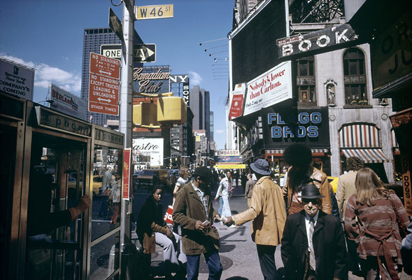
this photo was taken on a large format camera. that is why it so bland. Like the last photo it is full of colour this time it is the people who add the colour. The peoples clothes are the things which adds huge difference. The signs like most of the photos I have looked at are full of colour as well as warnings and instructions. The most of the street signs are in the top left hand corner. Then on the right there is a large building which extends the whole photo and further. This building has lots of signs on it including a black and white one. The shutter speed used in this photo would have been reassembly quick as there is not much motion blur. Also the aperture would have been around f13. this would have also let in a lot of light which is why the photo look a tiny bit over exposed. the colours used in this photo are quite bright, saying this they are also quite bland. the affect this has to make you spend longer looking at the image. a nice things at the top of this image is the one lone sign. The sign which says, W46st. This is nice because the photo is very crowded. Every thing is flowed by something else nothing is left by it self. This sign is to the left of the sky it looks like it trying to escape the rest of the busy life and run away. It is also the only one of its colour so in the way its being different as well. this image also adds in the human aspect to the image. with most of the other photographers there isn't that. this adds a whole new aspect to explore.
Modern photography
Modern photography seems to be from what I've seen about pushing limits. taking photos from new places; sky scrapers and space, and then pushing the boundaries of what a computer can manipulate. Lots, not all, seems also to be fine art as well. Even within other types of photography for instance journalism and documentary the photos coming out of the seem to be more arty then ever before. We live in the age where the person with the best computer skill is king and it seems like this has carried over to photography as well. many professional photographers still shoot in film like Simon Watson and fin O'Hara. Techniques used in modern photography have been prefect over thousands of years of photography. but it seems like this is dying out due to the readiness of shoot and snaps as well as the magazines paper copies coming redundant and being replaced by websites which can show videos as easy as showing pictures. i see in the future of photography that it will become a lesser part of today's uses as other forms of media take over.

Keegan Gibbs
Keegan Gibbs is a graffiti, surf, skate, urban, and landscape photographer. He is 30 years old and lives in although not born in, Malibu California. he was born into a family of artists and now travels the world taking photographers and surfing. He has worked on campaigns for company's like RVCA. In his work its clear he tries to capture his life style in, out, and all around the water. He also recently has turned to photographing graffiti artist and there travels. It is quite hard to find stuff out about Keegan as he its not quite pursed as famous although his work is still talented.

This photo is of a tall city skyline taken from just below the top. the artist has used a mid range aperture. you can tell this as its slightly blurred at the back of the photo, due to this the photographer would have had to use a long shutter speed, this would have been need to light up the photo. the photo has been taken at night and is light by artificial street lights. Most of the colours used are of cream. They look darker then usual due to the lighting used. the main focus of the photo from the photographers point of view is the man climbing the fire escape to the left of the image. The photographer has used rule of thirds in this image to improve the image. The effect this has is to read the image from left to right like a book making the image feel natural. The is a nice use of diagonals used in the image as the darkest point is bottom left and the lights point is top right. then its the same with the sky at the top and then the street lights below. the only colour used in this image which are not grey is the green sign behind. The photo is meant to seem black and white but as by the sign it was just a clever play on lighting which makes this effect. I like this image due the fact if you know the contents of the image then the main aspect is the man but if you don't your eyes are drawn to the sign. This image helps me think about different heights I could use when taking an image. It also adds the effect of using like to changing the contrast of the image.

This like the last photo is of a city top view. This one unlike the last photo has a higher f number, you can tell this because a. the lighting is very bright, b. behind the subject its quite clear. The f stop means the amount of light let in while the shutter is open, as its a small whole it lets a lot of light in meaning the background is quite clear. to make it brighter the shutter speed would have been quite long, this allows more light to come in brighten up the city, you can tell this as the man doing the graffiti his hand is blurry. this photo has a nice contrast between light and dark, the man on the right on the roof is a little underexposed meaning that its not the natural colours. As the photo has been made to get as much light in as possible the roof top would have been extra dark. this is a nice photo due the fact he has managed to get the man on the right light enough to see but not over done it to over expose the image. due to the contrast between light and dark the colours have been made a lot more pleasant. the brown of the first building on the left is sort of ready, it wouldn't be like that if it wasn't for the light used in the image. this means the because of the light the picture has been enhanced, which is a good way to improve my own images.
